Stir a vat of any liquid or gas and you get complex whirls of movement. Fluid dynamics, the study of the movement of liquids and gases, helps airplanes stay in the air, describes the way that blood flows through the human body, and factors into weather forecasting. Anything that flows and stirs into eddies follows the tenets of fluid dynamics.

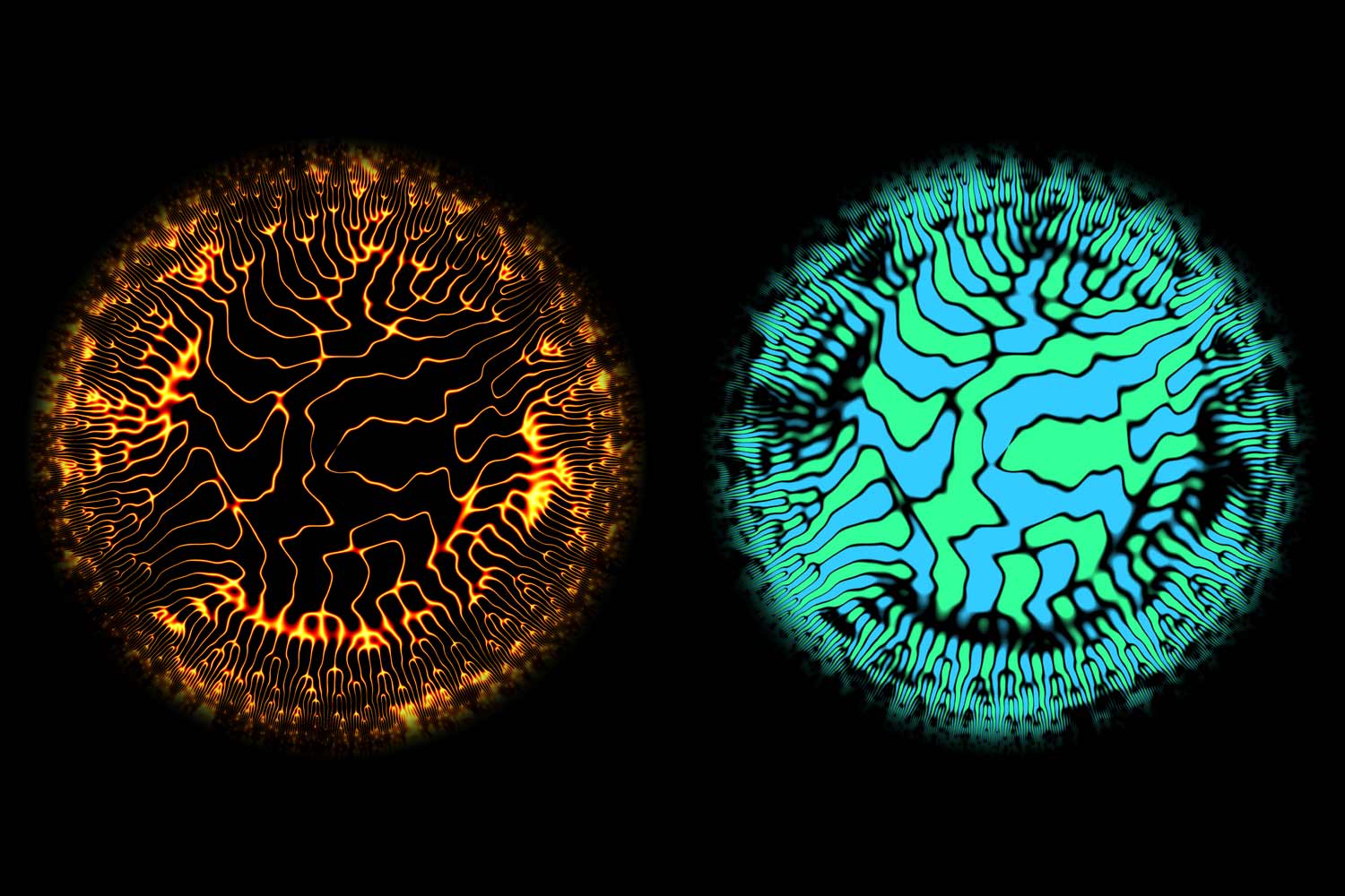
These paired images depict a computer simulation of turbulence within 100 cubic meters of air. In the image on the left, the black space represents air movement and the color is the still space between each eddy. The blue and green image highlights the bodies of moving air
A group of Stanford researchers has created a mesmerizing way of illustrating this kind of turbulent movement in a simulated cube of air. The resulting images are a snapshot of the data from one moment in an incredibly complex simulation.
The team who worked on the simulations – graduate students Maxime Bassenne and H. Jane Bae and postdoctoral fellow Adrián Lozano-Durán – won the Milton van Dyke award at the American Physical Society Division of Fluid Dynamics conference. They presented their poster in the Gallery of Fluid Motion, which highlights visual media that visually demonstrate not only the science, but also the beauty of moving materials.
In the team’s fiery-looking black and orange images, the black space represents air movement and the color is the still space between each eddy. The paired blue and green images are the same simulation, but highlighting the bodies of moving air.
The team members, all of whom work in Stanford’s Center for Turbulence Research led by Parviz Moin, a professor of mechanical engineering, said computer simulations are the only way to generate detailed data like their largest simulation, a cube of computer-generated “air” about 100 cubic meters in volume.
“Besides the difficulty of setting up the experiment and not disturbing the fluid with the probes, you’d need about one trillion probes to detect the kind of information that this simulation gives,” Bassenne said.
“It’s only now that computers are big enough to actually handle all of this information,” Lozano-Durán said. The file that they used to create the largest visualizations was nearly one petabyte of data, some of which was provided by researchers from the Aichi Institute of Technology, Okoyama University and the Technical University of Madrid.
Bassenne said he was inspired by Mark Fischer’s Aguasonic Acoustics project, in which the photographer transformed sound recordings from animals such as whales and birds into similar radial wavelet plots.