|
October 30, 2012
Stanford Election Atlas maps votes, polling place by polling place
A new interactive atlas from Stanford's Spatial Social Science Lab looks at the 2008 presidential election on the level of individual precincts. The exhaustive study reveals how deep-rooted geographic trends still affect party affiliation. By Max McClure
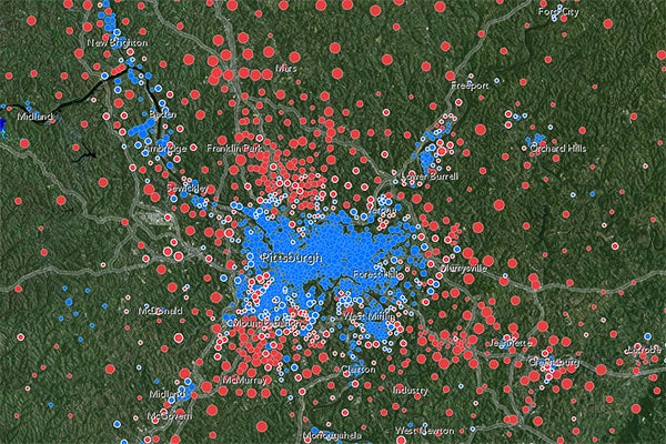
In 2008, urban Pittsburgh tended to vote Democrat, while surrounding areas voted Republican. Democratic precincts also cluster, however, along historical transportation corridors, such as the rivers to the city's northwest, northeast, and south. (Screenshot: ArcGIS Stanford Map)
We're all familiar with red states, blue states and, as Nov. 6 nears, the maddening indecision of the swinging purples. But state-level, and even county-level, polls aren't the whole story.
When presidential election results are examined at the level of individual polling places, subtler geographic trends emerge. Long-extinct transportation corridors and industrial centers remain deeply relevant determinants of voting trends in modern America. And looking at precinct-level data can illustrate the sometimes-stark political differences between adjacent neighborhoods in the counties thought of as simply "purple."
"You can see pretty dramatic voting changes when you literally cross a street," said Jonathan Rodden, professor of political science and director of the Spatial Social Science Lab (SSSL) at Stanford. "But you have to go below the county level to see it."
In an ongoing excavation of these hidden patterns, the SSSL has released the Stanford Election Atlas, an online interactive data visualization tool that allows users to inspect the precinct-by-precinct results of the 2008 presidential election.
The product of years of collaborative work at Stanford and Harvard universities and at mapping and geographic information system company Esri, the zoom-capable online atlas explores correlations between income, race and voting behavior across the United States. A customizable version allows users to combine the election data with other maps, including topographical and satellite images.
Canvassing precincts
Data collection for the project, handled by a team of researchers led by Rodden and Harvard Professor of government Stephen Ansolabehere, proved arduous.
"In the U.S., we don't have centralized election administration," said Rodden. "It's all handled at the county level."
The researchers were forced to collect and map separate polling data from every precinct – a task made even more difficult by the fact that the organizations that defined precinct boundaries were separate from those that actually counted the votes. (Oregon, which only uses mail-in ballots, remains blank for the moment.)
But the result enables a far more nuanced understanding of American patterns of residential partisan segregation than the old county-level maps.
"Now you can look at a place like Brooklyn and see, from voting patterns, where you cross from an African-American neighborhood to an Irish one," said Rodden.
Location, location, location
The map also clarifies some longstanding geographic divisions in American politics.
The pattern of rural Republicans and urban Democrats is well known. In 2008, Republican John McCain's voters were scattered through the exurbs of cities and in the rural periphery, Democrat Barack Obama's voters dominated in urban areas, and inner suburbs were evenly divided electoral battlegrounds.
But some of the most fascinating patterns revealed by the precinct-level data evoke legacies of the distant past. For instance, users can see that voters for Obama were arrayed along shorelines, rivers and 19th-century transportation corridors connecting the cities of the Midwest, where docks, factories and labor unions once thrived and working-class housing remains.
"You can see blue veins running through primarily red states, tracing out early 20th-century railroads," said Rodden. "And these are railroads that are long gone now."
Rural Obama voters also cropped up alongside certain historic industries, such as in the Deep South's cotton belt or in mining towns.
The coal industry, which has since become a focus of the Romney campaign's energy policy, represents an interesting case in the upcoming election. Former coal mining regions remain Democratic strongholds. "It's where they're still mining that Romney is showing gains," Rodden said.
Other battleground precincts can be seen by zooming in on states like Ohio and looking for dots outlined in white – polling places where a candidate garnered less than 55 percent of the vote.
"If you look at where Obama and Biden and Romney and Ryan have been going in Ohio," said Rodden, "they're all visiting those white dots."
The customizable map can be embedded in any web page by inserting the freely available HTML code.
-30-
|


