
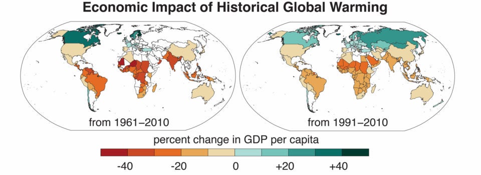
The map on the left shows countries where per capita GDP increased or decreased as a result of global warming between 1961 and 2010. The map on the right shows the same information from 1991, after economic data became available for more countries. (Image credit: Noah Diffenbaugh and Marshall Burke)
Climate change has worsened global economic inequality, Stanford study shows
The gap between the economic output of the world’s richest and poorest countries is 25 percent larger today than it would have been without global warming, according to new research from Stanford University.
A new Stanford University study shows global warming has increased economic inequality since the 1960s. Temperature changes caused by growing concentrations of greenhouse gases in Earth’s atmosphere have enriched cool countries like Norway and Sweden, while dragging down economic growth in warm countries such as India and Nigeria.
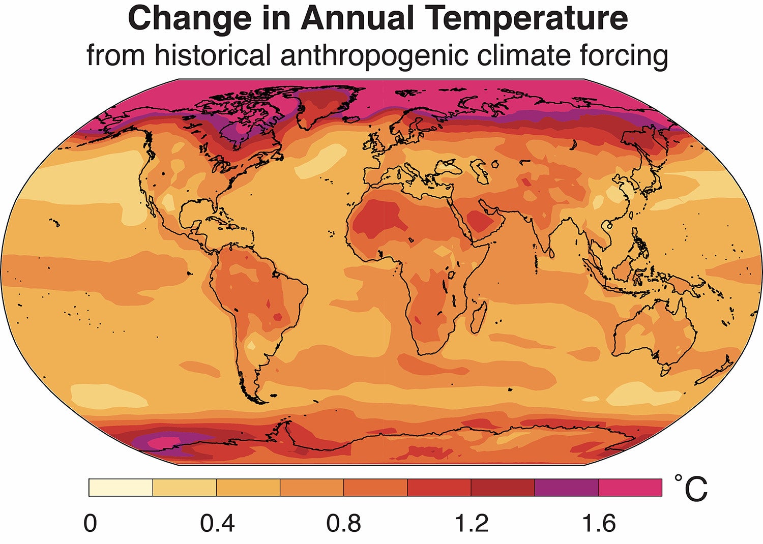
An analysis by Noah Diffenbaugh and Marshall Burke shows that warming that has already happened – 1 degree Celsius or 1.8 degrees Fahrenheit globally above the pre-Industrial average – has increased economic inequality around the world. (Image credit: Noah Diffenbaugh and Marshall Burke)
“Our results show that most of the poorest countries on Earth are considerably poorer than they would have been without global warming,” said climate scientist Noah Diffenbaugh, lead author of the study published April 22 in the peer-reviewed Proceedings of the National Academy of Sciences. “At the same time, the majority of rich countries are richer than they would have been.”
The study, co-authored with Marshall Burke, a Stanford assistant professor of Earth system science, finds that, from 1961 to 2010, global warming decreased the wealth per person in the world’s poorest countries by 17 to 30 percent. Meanwhile, the gap between the group of nations with the highest and lowest economic output per person is now approximately 25 percent larger than it would have been without climate change.
Although economic inequality between countries has decreased in recent decades, the research suggests the gap would have narrowed faster without global warming.
Ideal temperature for economic output
The study builds on previous research in which Burke and co-authors analyzed 50 years of annual temperature and GDP measurements for 165 countries to estimate the effects of temperature fluctuations on economic growth. They demonstrated that growth during warmer than average years has accelerated in cool nations and slowed in warm nations.
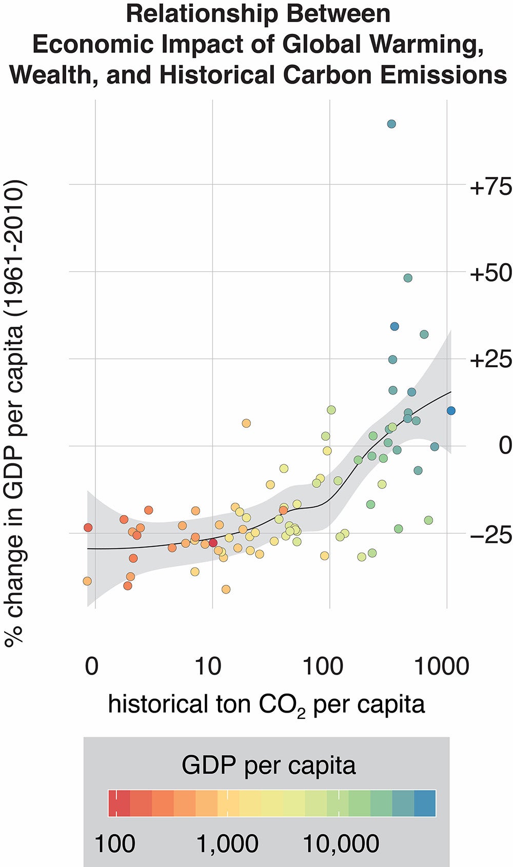
Countries with high historical emissions are among those that have enjoyed the highest per capita GDP and fastest economic growth since the 1960s, while those with relatively low historical emissions have seen per capita GDP decline. (Image credit: Noah Diffenbaugh and Marshall Burke)
“The historical data clearly show that crops are more productive, people are healthier and we are more productive at work when temperatures are neither too hot nor too cold,” Burke explained. “This means that in cold countries, a little bit of warming can help. The opposite is true in places that are already hot.”
In the current study, Diffenbaugh and Burke combined Burke’s previously published estimates with data from more than 20 climate models developed by research centers around the world. Using the climate models to isolate how much each country has already warmed due to human-caused climate change, the researchers were able to determine what each country’s economic output might have been had temperatures not warmed.
To account for uncertainty, the researchers calculated more than 20,000 versions of what each country’s annual economic growth rate could have been without global warming. The estimates in the paper capture the range of outcomes delivered by those thousands of different routes.
“For most countries, whether global warming has helped or hurt economic growth is pretty certain,” said Burke. Tropical countries, in particular, tend to have temperatures far outside the ideal for economic growth. “There’s essentially no uncertainty that they’ve been harmed.”
It’s less clear how warming has influenced growth in countries in the middle latitudes, including the United States, China and Japan. For these and other temperate-climate nations, the analysis reveals economic impacts of less than 10 percent.
“A few of the largest economies are near the perfect temperature for economic output. Global warming hasn’t pushed them off the top of the hill, and in many cases, it has pushed them toward it,” Burke said. “But a large amount of warming in the future will push them further and further from the temperature optimum.”
Dragged down by warming
While the impacts of temperature may seem small from year to year, they can yield dramatic gains or losses over time. “This is like a savings account, where small differences in the interest rate will generate large differences in the account balance over 30 or 50 years,” said Diffenbaugh, the Kara J. Foundation professor in Stanford’s School of Earth, Energy & Environmental Sciences (Stanford Earth). For example, after accumulating decades of small effects from warming, India’s economy is now 31 percent smaller than it would have been in the absence of global warming.
At a time when climate policy negotiations often stall over questions of how to equitably divide responsibility for curbing future warming, Diffenbaugh and Burke’s analysis offers a new measure of the price many countries have already paid. “Our study makes the first accounting of exactly how much each country has been impacted economically by global warming, relative to its historical greenhouse gas contributions,” said Diffenbaugh, who is also Kimmelman Family senior fellow in the Stanford Woods Institute for the Environment.
While the biggest emitters enjoy on average about 10 percent higher per capita GDP today than they would have in a world without warming, the lowest emitters have been dragged down by about 25 percent. “This is on par with the decline in economic output seen in the U.S. during the Great Depression,” Burke said. “It’s a huge loss compared to where these countries would have been otherwise.”
The researchers emphasize the importance of increasing sustainable energy access for economic development in poorer countries. “The more these countries warm up, the more drag there’s going to be on their development,” Diffenbaugh said. “Historically, rapid economic development has been powered by fossil fuels. Our finding that global warming has exacerbated economic inequality suggests that there is an added economic benefit of energy sources that don’t contribute to further warming.”
Diffenbaugh is also an affiliate of the Precourt Institute for Energy. Burke is a center fellow at the Freeman Spogli Institute for International Studies and, by courtesy, at the Woods Institute for the Environment.
The research was supported by the Center for Computational Earth and Environmental Science, the Stanford Research Computing Center and Stanford University.
To read all stories about Stanford science, subscribe to the biweekly Stanford Science Digest.